

What Polls Say, What Killers Do
Reading Two Charts of American Political Violence

Abstract
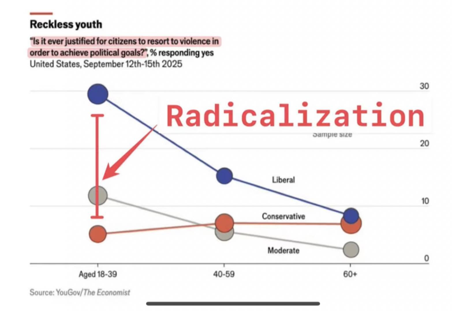
Two recent visualizations sit across one another like a chess problem. The first, drawn from The Economist’s coverage of an Economist/YouGov poll fielded September 12 through 15, 2025, shows young liberals saying yes to the question of whether violence is ever justified to achieve political goals at roughly four times the rate of any other ideological-age cell. The second, an Anti-Defamation League graphic summarizing twelve years of extremist-linked killings, shows right-wing actors responsible for 75.5% of 494 deaths between 2013 and 2024. Read in sequence, the two charts produce a small whiplash. This paper argues that the whiplash is real and instructive. The Economist chart measures a verbal disposition; the ADL chart counts bodies. The gap between them has been documented across measurement studies, comparative datasets, and a decade of incident-level reporting from PIRUS at the University of Maryland and the Center on Extremism. Taking both charts seriously, rather than weaponizing one against the other, gives a clearer picture of what is happening and what is not. Young liberals appear more willing to say a strong word about violence to a survey panel; right-wing extremists, with deeper organized networks and a particular attachment to firearms and accelerationist literature, are more likely to actually kill someone. Both statements are supported by evidence. They sit on opposite sides of an attitude-behavior gap that political scientists have been discussing and debating since at least 2017. This revised version adds a section on why right-leaning Americans see a different pie, drawing on Benkler, Faris, and Roberts’s research on the asymmetric U.S. media ecosystem, and a section on the rapid 2025–2026 surge in firearms ownership among LGBTQ and especially transgender Americans, where the constitutional right to armed self-defense intersects with the very pattern these charts describe.
Keywords: political violence, radicalization, survey methodology, extremism, attitude-behavior gap, ADL, YouGov, asymmetric media, transgender Second Amendment
Two Charts on the Same Desk
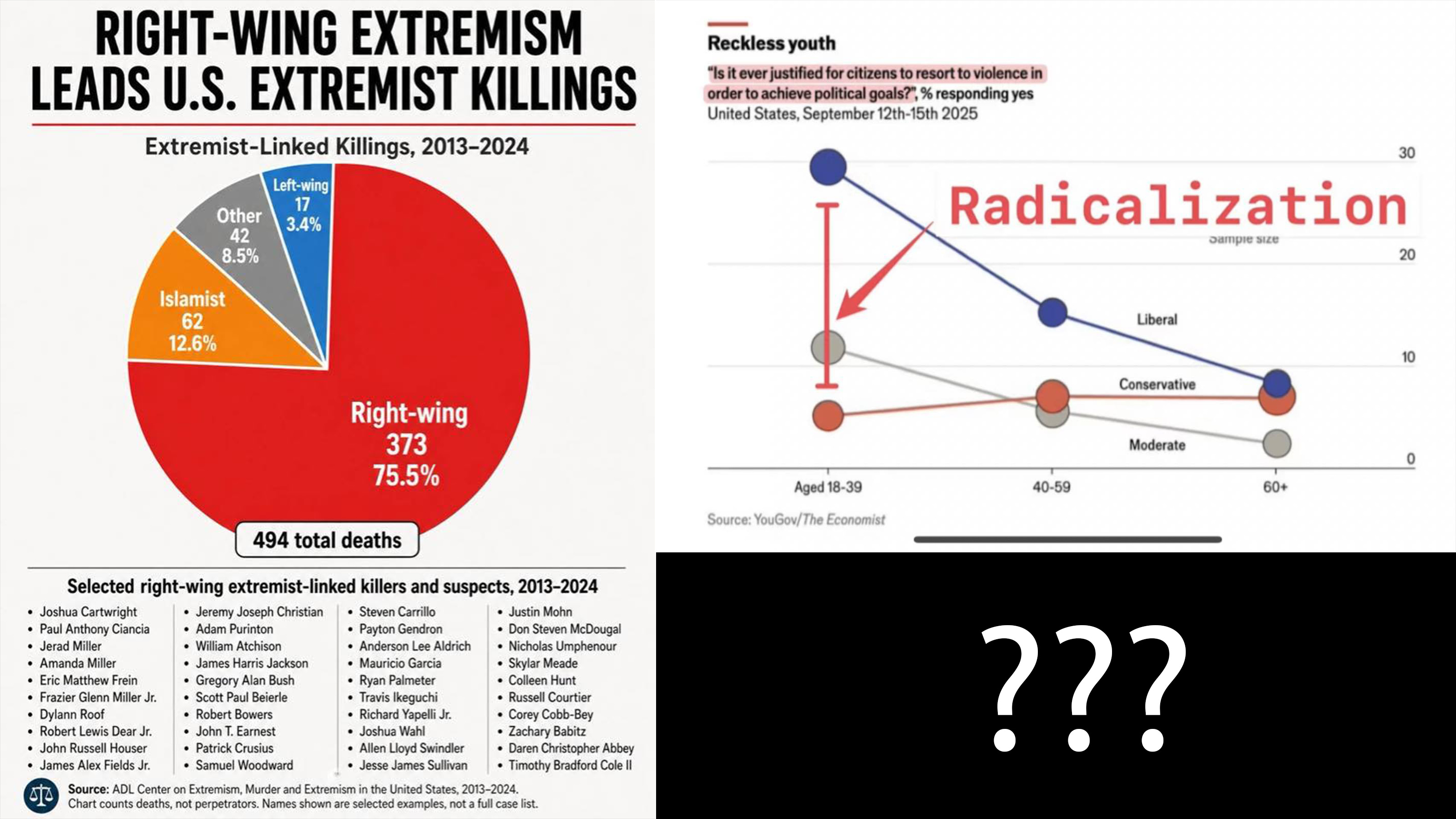
I keep both images open in tabs as I write this, the way I once kept two contradictory hospital lab reports open during my son’s stay in the ICU. The Economist chart has the cool red line of a magazine that writes for people who read with a pencil. Its title is “Reckless youth.” The line for self-identified liberals between 18 and 39 jumps off the top of the y-axis like a bad EKG, sitting near 30%. In comparison, the lines for moderates and conservatives in the same age bracket range from 4% to 12% (Economist/YouGov, 2025). The ADL chart lacks that restraint. It is a pie sliced into four wedges, the largest one painted the color of a stop sign, with the words “Right-wing 373, 75.5%” stamped across it (Anti-Defamation League, 2025). Below the pie, in two narrow columns, sits a list of names. Some I had to look up. Some, like Dylann Roof and Robert Bowers, I did not.
These are not the same kind of object. The first chart is a snapshot of what 1,567 American adults told a survey panel in the four days after Charlie Kirk was shot at Utah Valley University. The second is the death toll. The methodological distance between a pollster’s dropdown menu and a list of people who shot or stabbed or drove a vehicle into a crowd is enormous, and the distance is the entire point of this paper. Anyone with a Twitter account has spent the last two months watching one chart get used to dismiss the other. The right has waved the YouGov bar to claim that the actual face of American extremism is a queer kid in a black turtleneck on a college campus. The left has waved the ADL pie to claim that all this hand-wringing about young liberals is statistical theater meant to draw attention away from the white men who actually do the killing. Both moves are sloppy. Both leave evidence on the table.
So let me lay both charts down and look at them honestly.
What the YouGov Chart Actually Measures
The Economist/YouGov tracking poll, fielded September 12 through 15, 2025, asked 1,567 American adults a single line of text: “Do you think it is ever justified for citizens to resort to violence to achieve political goals?” The response options were yes, no, and not sure. The toplines were calm. Seventy-eight percent of Americans said violence is never justified, including 75% of Democrats and 89% of Republicans (YouGov, 2025a; YouGov, 2025b). The trouble starts in the cross-tabs. Adults under 30 said “never justified” at a rate of 63%, compared with 82% among older Americans (YouGov, 2025b). When YouGov sliced the data by ideology in adjacent surveys that same week, 25% of self-identified “very liberal” respondents and 19% of adults under 30 said violence could “sometimes be justified” (YouGov, 2025a). The cell that produced the spike on The Economist’s chart, liberals aged 18 to 39, sits near the intersection of those two slices. A separate Harvard Youth Poll fielded after the Kirk killing put the figure higher still, with 40% of young Americans saying political violence was acceptable under at least one specified circumstance (Harvard Public Opinion Project, 2025).
Take a beat with that 40%. It looks lethal. It is not, in any operational sense, what it appears to be.
The most thorough academic treatment of why these numbers misbehave comes from Sean Westwood, Justin Grimmer, Matthew Tyler, and Clayton Nall, writing in the Proceedings of the National Academy of Sciences (Westwood et al., 2022). Their paper, blunt enough to start a small academic war, was titled “Current research overstates American support for political violence.” Across four large survey experiments with 4,904 respondents, they found that prior estimates inflated apparent support for violence by about a factor of 6. Two reasons. First, hypothetical questions about “violence” without specifying what kind let respondents answer about whatever shape of confrontation lives in their heads. A respondent picturing a shoving match at a school board meeting and a respondent picturing an assassination both pick the same yes button. Second, a portion of any large online sample consists of respondents who click through to collect the incentive payment, with attention so degraded that random response patterns swamp the signal at the low-prevalence end of the distribution. After Westwood and colleagues controlled for both, the median estimated support for partisan violence dropped from about 18.5% to about 2.9%. Specific extreme acts, when named, draw single-digit support across the spectrum (Westwood et al., 2022).
This does not mean every survey on political violence is junk. Nathan Kalmoe and Lilliana Mason, writing in Radical American Partisanship (Kalmoe & Mason, 2022), pushed back hard. They argue that even granting measurement error, the trend lines and the demographic patterns hold. By February 2021, in a YouGov panel they had been tracking since 2017, 20% of Republicans and roughly one in eight Democrats endorsed partisan violence “today” (Kalmoe & Mason, 2022, ch. 5). The argument between the Westwood camp and the Kalmoe-Mason camp is now a fixture of political-science conferences, with both sides agreeing on a few quiet points. Most respondents who say yes to a vague violence question do not, when pressed about killing or shooting, say yes again. The pool that endorses lethal violence in any concrete form is small, somewhere in the low single digits. And that small pool’s composition shifts with which side of the political map has just been attacked (YouGov, 2025a).
What does this mean for the spike on The Economist chart?
It means the spike is real, in the sense that more young liberals than older or right-leaning Americans selected the ‘yes’ option. The gap between selecting that button and walking out of one’s apartment with a rifle is the entire span of a person’s actual life. A small share of the people on that 30% data point would have answered yes to “should the federal government allow forceful resistance against a tyrannical regime in some abstract scenario.” Almost none of them, on a behavioral basis, will hurt anyone. The chart is not measuring a force; it is measuring a temperature.
What the ADL Chart Actually Measures
The ADL Center on Extremism has published an annual report on extremist-related murders for ten years running, and tracks the underlying incidents back to 1970 (Anti-Defamation League, 2025). The methodology is constrained in a way that the polling work is not. ADL counts a death only when an offender has documented ties to an extreme ideology or movement. The connections sometimes take years to surface, which is why each year’s report revises the prior year’s totals upward (the 2023 figure rose from 17 in the initial report to 20 in the latest one). The pie chart shown in the second image draws on the cumulative 2013–2024 totals: 494 people killed, 373 of them by right-wing actors, 62 by Islamist extremists, 42 by “Other,” and 17 by left-wing actors. Eight of the thirteen 2024 deaths involved white supremacists; five involved sovereign citizen and other anti-government far-right offenders. For the third year in a row, every documented extremist-related killing in the U.S. was committed by someone connected to the right (Anti-Defamation League, 2025).
This is not an artifact of one organization’s bookkeeping. The Center for Strategic and International Studies independently tracked terrorist incidents. It reached the same shape of distribution years earlier, with right-wing terrorism overtaking Islamist terrorism in incident counts during the late 2010s (Jones, 2018). The Profiles of Individual Radicalization in the United States (PIRUS) database at the University of Maryland’s National Consortium for the Study of Terrorism and Responses to Terrorism, which catalogs more than 3,500 radicalized individuals on a multidecade horizon, shows the same asymmetry. Far-right offenders make up the largest single ideological category in PIRUS at 1,678 individuals, compared with 537 far-left offenders and 579 Islamist offenders (Jensen et al., 2023). When Jensen and colleagues compared the conditional probability of violence given radicalization across categories, they found that radical acts carried out by left-leaning individuals were less likely to be violent in both their U.S. data and their global data (Jensen et al., 2022).
The ADL pie chart is not an outlier presentation. It is a typical view of a stable empirical pattern. Right-wing radicalization, in the United States, kills more people than any other category. The gap is wide enough that disputing it requires an enormous amount of ideological labor.
